How To Build Real Estate Investor Landing Pages For Conversion
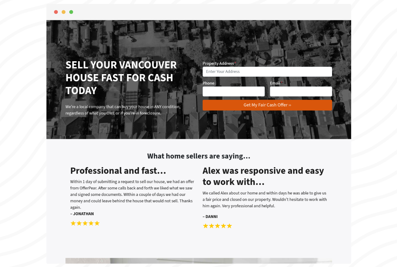
Real estate investor landing pages are a critical tool in a real estate investor’s toolbox. Landing pages are a great solution when you want to send a specific audience a specific message.
A well-optimized landing page has the power to turn casual visitors into hot leads. Every element, from the headline to the call-to-action, serves a purpose, and when structured effectively, it guides the visitor towards a single, conversion-driven goal: filling out a form or calling your business number
Here are some foundational marketing principles for real estate investor landing pages
- They typically don’t have the main navigation on it so a user doesn’t get distracted and click away
- They are short and to the point
- The landing page headline should match the ad they clicked to get there
- There should be a CLEAR call to action and not multiple options
- They must work amazing on mobile
Let’s dive in with a step-by-step breakdown of how to build real estate investor landing pages for conversion.
Headline: Capture Attention Immediately
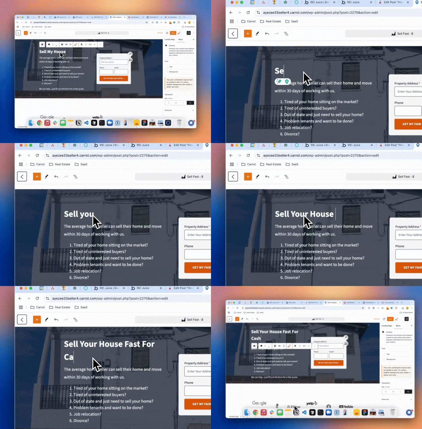
Your headline is the first thing visitors see, and it needs to communicate the benefit or value of your offer. For real estate investors, it’s essential to address the specific pain points of your audience right away.
I have seen real estate investors have the best success with landing page headlines if they match the message the traffic is coming from.
For example…if you have a Google Ad with the headline “Sell Your Home Fast for Cash—No Repairs Needed.” It would make sense to have your landing page have the same headline.
Why it’s important: This headline is powerful because it speaks directly to a key concern of motivated sellers—they want a fast, hassle-free sale. By addressing the audience’s problem upfront, you immediately establish relevance and trust, making visitors more likely to stay and explore the page further.
💡 Remember – landing pages are more about persuasion. So don’t worry about keywords and trying to rank the content in Google.
Subheadline: Reinforce the Offer
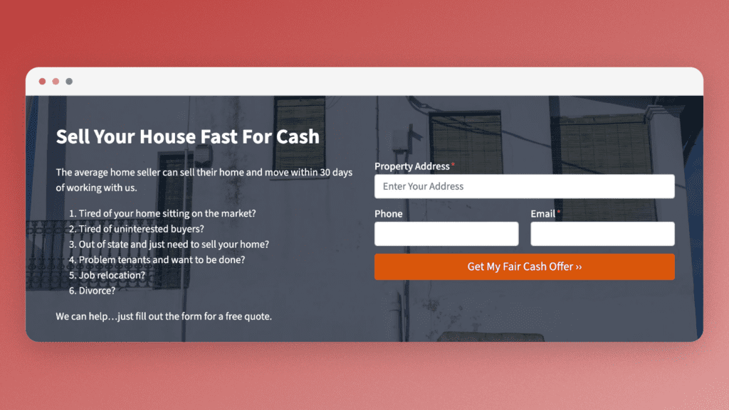
A strong subheadline supports your headline by providing additional context or emphasizing the unique benefits of your service.
Example: “Get a Fair Cash Offer in 24 Hours—Close in as Little as 7 Days.”
Why it’s important: The subheadline reinforces the speed and simplicity of your offer. This works especially well in real estate investment, where sellers are often motivated by urgency. The subheadline also provides a sense of credibility and confidence, addressing potential objections like lengthy closing times.
Hero Image: Visualize the Value
The hero section should include a clean, professional image that supports your offer. Ideally, this image should convey the outcome or benefits of working with you, such as a happy homeowner after closing a sale.
Example: A smiling couple in front of a “Sold” sign, or a photo of a modern, move-in-ready home.
Why it’s important: People process visual content faster than text, and your hero image sets the tone for the rest of the page. Real estate is an emotional industry, and the right imagery can help create a sense of trust, reliability, and urgency in your visitors’ minds.
Lead Form: Make It Short and Simple
Your lead form is the most critical element of your landing page—it’s where conversions happen. To maximize conversion rates, keep it concise and focused on the essentials. Limit the number of fields to prevent overwhelming visitors.
Example: Name, phone number, email, and property address.
By default Carrot landing pages make it super easy to just pick a lead form you want to have for your landing page. You can create custom forms per campaign or just use the same one for all your marketing.
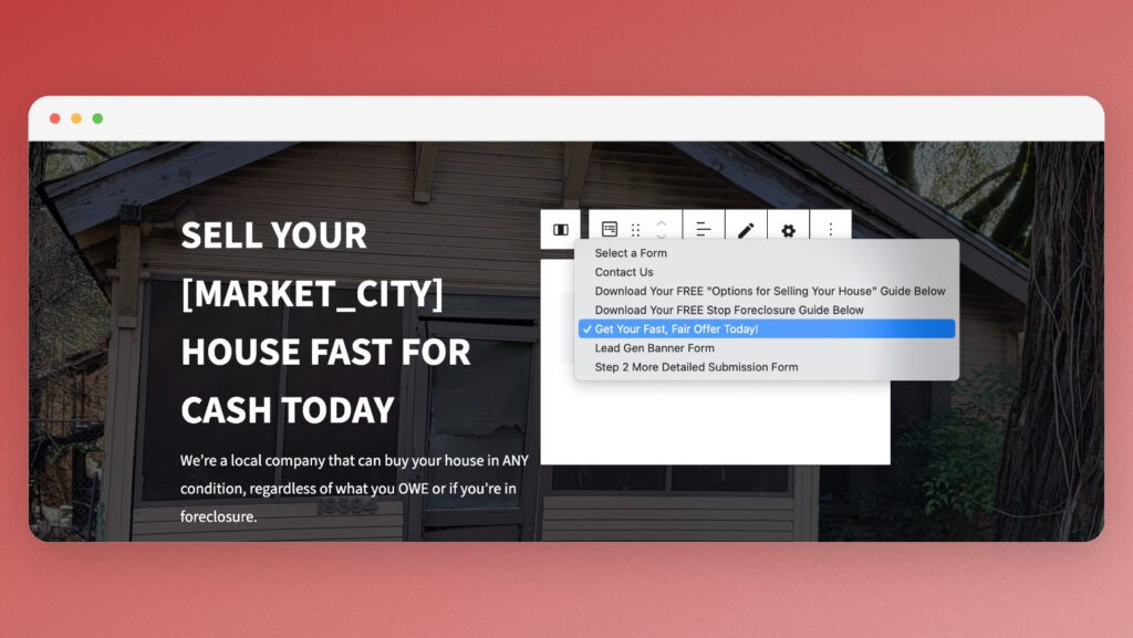
Why it’s important: The more fields you ask visitors to fill out, the higher the chance of form abandonment. Real estate investors should aim to collect only the information necessary for initial contact. You can always gather more details later in the process.
Social Proof: Build Trust
Social proof, such as testimonials or reviews, helps establish credibility. Real estate investors can leverage testimonials from past sellers or showcase the number of deals completed.
Carrot makes adding credibility like testimonials, reviews websites, and stats as easy as two clicks.
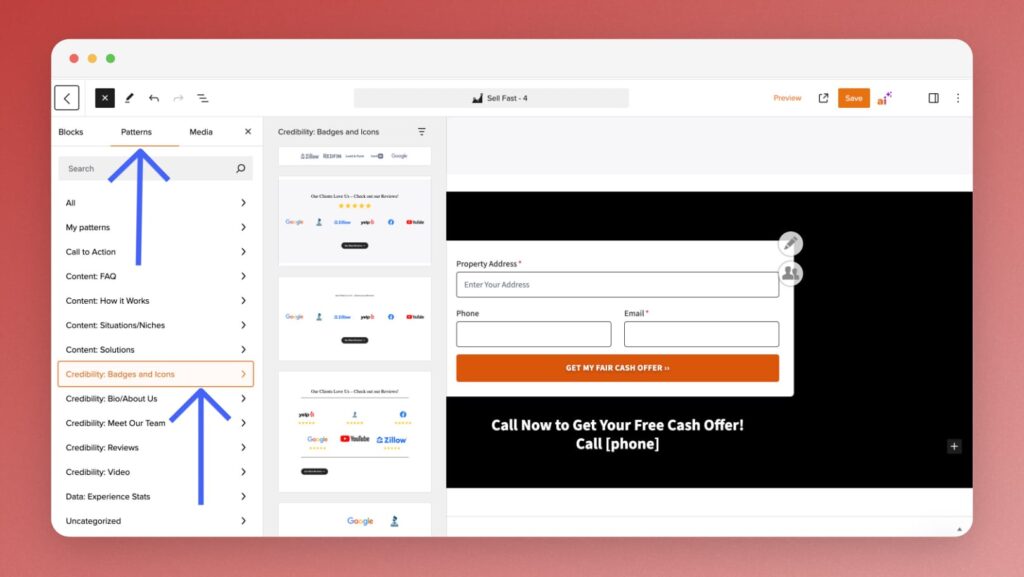
Example: “I sold my home in just two weeks, and they took care of everything! Highly recommend this team!” – John D.
Why it’s important: Buying or selling real estate is a significant decision, and visitors need reassurance that they’re working with a trustworthy company. Social proof helps overcome skepticism and builds confidence that your service will deliver on its promises.
Value Proposition & Bullet Points: Highlight Key Benefits
Beneath your hero image and lead form, use bullet points to quickly summarize the main benefits of your offer. Make sure these points are clear and specific to the needs of your audience.
Again – Carrot makes this really easy with design patterns that focus on the process, how it works, steps, and more.
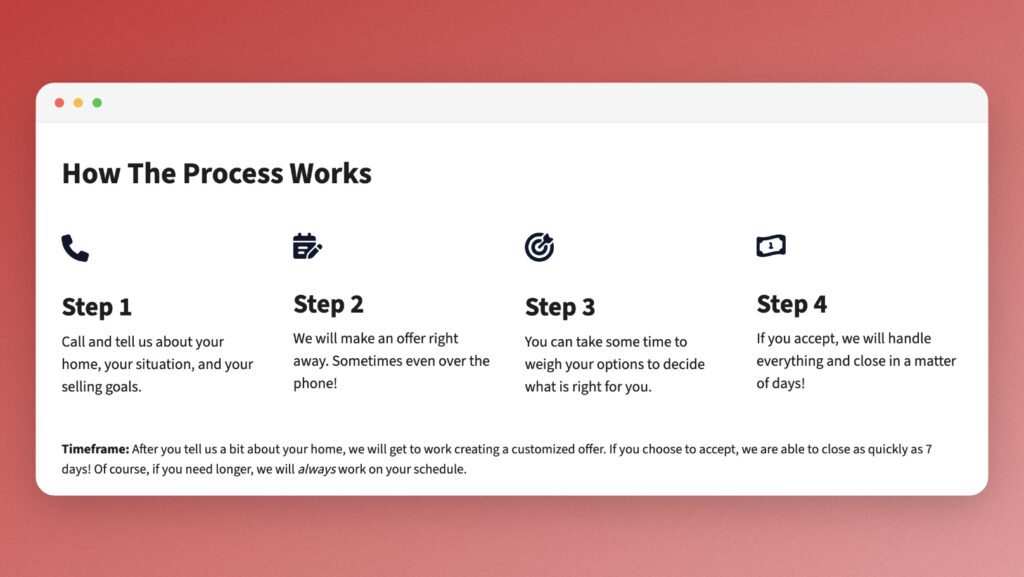
Example:
- No closing costs or realtor fees.
- We buy houses in any condition.
- Fast, no-obligation cash offer.
Why it’s important: Busy visitors often skim landing pages, and bullet points allow them to quickly understand the advantages of working with you. This section reinforces your value proposition and gives visitors the information they need to take action.
Call to Action (CTA): Clear and Actionable
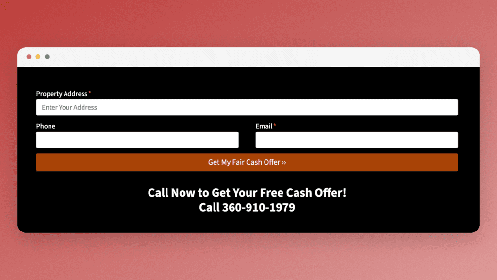
Your CTA button should be direct and encourage immediate action. Use compelling, action-oriented language that reinforces the benefit of clicking.
Example: “Get Your Free Cash Offer Now” or “Start the Process Today.”
Why it’s important: Your CTA is the final step in guiding visitors toward conversion. It should be easy to find, highly visible, and linked to the desired outcome. A weak or vague CTA will result in missed opportunities, while a strong, focused CTA drives conversions.
Footer: Add Trust Signals
The footer is often overlooked, but it’s a great place to add trust signals, such as certifications, guarantees, or even a privacy policy link that ensures the safety of a visitor’s personal information.
Example: “Your information is safe with us. We will never share your details.”
Why it’s important: In real estate investing, where sellers may already feel vulnerable or uncertain, small details like privacy assurance can make a big difference in building trust and encouraging visitors to submit their information.
Conclusion
Building the perfect real estate investor landing page is all about understanding your audience and crafting each element to guide them toward taking action. By focusing on the essentials—headlines, forms, social proof, and clear CTAs—you can create a landing page that not only looks great but also converts.
Remember, the goal of every landing page is to provide a seamless, reassuring experience for your visitors, ultimately transforming them from curious browsers into valuable leads. Implement these tips, test variations, and watch your conversion rates improve!